About

Showing posts with label living room. Show all posts

Sunday, April 8, 2012

Loving this Makeover!

(all photos via houseandhome.com)

Happy Monday!  I see plenty of before and afters and some are predictable and some really knock my socks off.  I found this makeover at House and Home and I truly love everything about it.  I found myself going back and forth between the befores and afters and thinking, "How did she do that?"  Here are some things that I particularly love:

1.  I think her place before was something we can all relate to.  Not awful, nice bones, but they really didn't reflect any style or personality.  I think we all have or have had rooms like these.  How inspiring to see how furniture placement, paint and being selective with choosing some really interesting pieces can just really change a space COMPLETELY!

2.  Painting the trim and wall the same color.  I know I tend to think, "Oh I want to highlight the trim or the crown molding, so I purposely choose a different wall color.  But after looking at several of her rooms, the thing that really makes the room seem bigger and the walls almost recede and seem endless is that there's no definition between, wall and window.  Except for the bathroom, it shows how interesting white walls and trim can be!  Inspiring if you can't or don't want to paint.

3.  Texture!  We've heard all designers talk about texture, but it really does make a space come alive.  Check out each of Emma's rooms... Maybe with the exception of the bathroom, every space as a bit of nature (trees, branches and flowers) , metallics (gold or metal finishes), sleek, hard surfaces and lots of soft throws and furs.

Enjoy these pics!  Thanks Emma for the inspiration!  And click over here to see the full house tour.

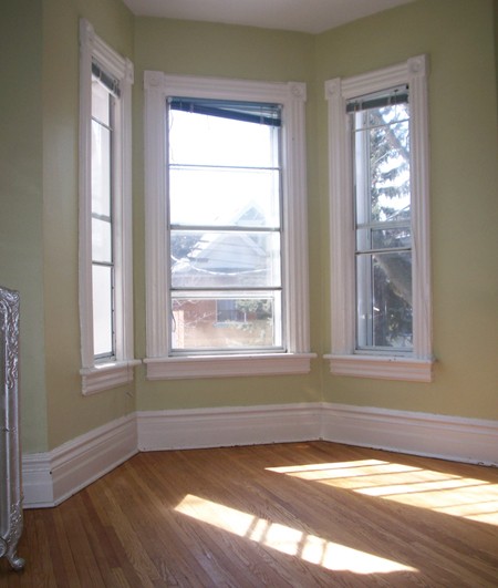
Living Room BEFORE

Living Room AFTER
Loving the fig tree, stacked logs, wire chairs and furs

Kitchen BEFORE

Kitchen AFTER
Loving the dark floors, (maybe slate?) and the marble backsplash!
Also, contrasting counter tops.. white on the cooktop side and dark on the island.

Chalkboard door.
What's not to like.  Great place for chalkboard paint if you don't
want to invest in painting a whole wall.

Dining BEFORE

Dining AFTER
Loving the sharp contrast between white and black. 
Another great tree and bold, oversized art.  Too often, artwork is too small.

Master Bedroom BEFORE

Master Bedroom AFTER
Loving the scale of the 2 pieces of artwork and the placement of the bed.
I wouldn't have thought of that, but oh so cozy!  Great textiles too!

Bathroom BEFORE 

Bathroom AFTER
 I actually thought it wwas pretty good to begin with... but...
Loving the blue/black paint and the shower curtain!!
( if you're curious... paint is BM, Raccoon Fur)

Friday, July 8, 2011

IKEA FRIDAYS - Meet EKTORP


I have to say, I've always liked to look of a white slipcovered sofa.  I love that it feels easy, casual and cool.  It can go from California Beach Cool to East Hampton Classic and Chic.  It's like the all american, basic white tee.  Timeless and can be dressed up or down.  These sofas also come in a wide variety of prices depending on the manufacturer, fill and the fabric.  Pottery Barn has made these slip covered sofas famous, but they are not in everyone's budget.  The PB Basic Sofa starts at around $1100. 

The IKEA EKTORP is a great alternative and depending on the slipcover ranges from $399 - $599.  Not bad at all. 

If you're wondering how the EKTORP compares to a PB slipcovered sofa, head on over here.  Melanie of My Sweet Savannah does a great job of sharing her experience with her EKTORP sofa.  She calls her sofa McCreamy... ha ha... love it.  :)

Have a great weekend!

Friday, April 29, 2011

IKEA FRIDAYS - Meet EDLAND


(via today.com)

As I write this, Thursday night, the Royal Wedding has yet to happen.  I'm sure everyone will be all abuzz about it by the time you read this.  I won't be staying up to watch it, but I will be catching it first thing tomorrow morning!  There won't be anything else like it!  Can't wait!  :D  So... in honor of the Royal Wedding, I thought I should pick out something a bit more stately and refined this week.  I think the EDLAND dresser fits the bill.


I've liked the EDLAND suite for a long time.  It's a nice departure from the boxy, modern shapes typical of IKEA furniture.  This piece really looks like it has a bit of old world character.  I love the legs and the feminine lines of all the pieces.  So beautiful.  Plus, to really make it look un-IKEA, changing out the knobs with some Anthropologie ones would be so easy!

The 2 drawer dresser here is $199.  I've been considering getting 2 of these for either side of our fireplace in our living room.  What do you think?


Have a wonderful weekend!  Praying for a bit of sun....   See you Monday.

Monday, March 7, 2011

WHY IT WORKS - A Charming Living Room

Hello!  Here we go with WHY IT WORKS Mondays!  Here's a room that I saw way back and just dug out recently.  It's amazing how good design is timeless. This room was published in House and Home back in 2009.  I know only 2 years ago, but the colors and ideas remain just as fresh today.  Here's the break down.


(via houseandhome.com)

WHY IT WORKS:

  • Color Palette.  Man, isn't this room just plain beautiful to look at?  That framed textile is just gorgeous!
  • Lines.  Notice how the lines of the couch, side chair and table are curvy and "light".  Nothing big, square or bulky.  It plays off the circles of the artwork and makes the whole room feel light and playful.
  • Pops of color.  Notice how the colors in this room just dance around.  A splash of yellow in the garden stool, some magenta in the side chair, lovely colors in the throw pillows and all nicely balanced out with a creamy white rug, lamp and accessories.

INSPIRATION:

  • Framed textile or paper as artwork.  I love this idea!  There are so many beautiful fabrics and papers out there.  There's a print and color palette for everyone.  Frame it up and you add instant graphic punch to a space.  Best thing, you put it together yourself, so it's one of a kind!
  • White lamps.  The lamps in this room are interesting.  They almost fade into the background and you hardly notice them.  It allows the artwork and furniture to pop into the foreground.  Maybe try this same technique in your space.
  • Throw pillows.  Boy, sometimes placing throw pillows on a couch or a bench can seem like putting together a work of art in itself.  There's a fine balance between too much and too little.  I like this arrangement that they have. 3 on one side and 2 on the other.  All coordinating solid colors.  Nice.

To see more photos of Emily Walker's charming home, click here.


Monday, November 8, 2010

Why It Works - A Charlotte Living Room

Boy, when I saw photos of this living room, I was immediately in love!   This is the home of interior designer, Beth Keim, owner of Lucy and Company in Charlotte, NC.  Let's break it down!


(image from lucyandcompany.com)


WHY IT WORKS:
  • Wall Color!  HELLO!  (you remember that line from Jerry McGuire?  "you had me at hello")  What a gorgeous choice! 
  • Symmetry.  The lamps behind the sofa definitely works!  One of my favorite looks is a sofa table behind a sofa, especially if the back of the sofa is facing another room like in this photo.  It helps that those lamps are GORGEOUS!
  • Accent color.  Notice how the accent colors are spread throughout the room so that there's a sense of flow among all the elements.  You have orange in the throw pillows, lamps, decorative bowl, and side chair.

INSPIRATION:

  • Wall color.  This is a big decision and not something you want to rush into.  Always buy small samples and do test patches.  If you have a room that has lots of light and white trim, you can definitely get away with bolder colors and it doesn't feel too heavy.  Notice all the white trim in the inspiration room.
  • Matching lamps.  ALWAYS look chic.  You can place them on an entry, sofa table, buffet, mantle... you can't go wrong!
  • Color Palette.  Pick a palette and stick to it.  I like spaces where I can immediately pick out a color palette, rather than a hodge podge of colors and patterns.  To me, it's calming.  I love how she picked a color palette and committed to it.  It makes more of an impact.  There are tons of gorgeous things out there... but you don't have to bring them all home.  :)
Later this week, I'll be sharing more inspiring ideas from Beth's beautiful home.

Monday, September 6, 2010

An Eclectic LA Living Room

WHY THIS WORKS


  • Texture. I love the softness of the room. Notice the woven shades, the woven armchairs, and the cozy blanket.
  • Live plants. Plants add so much life to a room. The fern, palm and fresh flowers really add freshness to the space.
  • Furniture placement. Many people have a similiar room to this one, including me. This is a great way to arrange seating to encourage conversation.  All you need is a sofa/loveseat and 2 armchairs.

INSPIRATION

  • Plants. Even if you don't have a green thumb, adding low maintenance plants to a room really adds life to a room, literally. Go to a nursery and tell them what the light is in your space and they can help you.  There are many low maintenance house plants available.
  • Furniture placement. Is your furniture pushed up against the wall? Bring them into the room to create coziness and conversation areas.
  • Texture. Do you have any natural elements in your room? Baskets are a great way to add texture and they can do double duty as storage.

This room is a prime example of looking at a room and taking inspiration from it, even if it's not your own personal style. Personally, I wouldn't put a stuffed goose on my mantel, BUT... I could copy that same arrangement with a mirror plant and another large focal point. 
image from House Beautiful

Monday, August 23, 2010

A Tailored Living Room

WHY THIS WORKS

  • Color. Your eyes bounce around this room because of 2 accent colors. Notice the lime green and turquoise spread throughout the room?
  • Artwork. One of the most common decorating mistakes is using artwork that is too small and it's hung too high. These 2 pieces fit the large wall behing the sofa and are hung just right.
  • Finishes/Materials. This room has a great mix of finishes like glass, wood, soft fabrics and even some shine in the stool. The room would feel a lot heavier if they had used a heavy, solid coffee table.


INSPIRATIONS:

  • Palette. Do you have 2-3 colors that your eye can focus on and jump to?
  • Artwork. Does the scale fit and are they hung at eye level?
  • Finishes. Do you have a mix? Soft, hard, clear, heavy?


(image from Canadian House and Home)

LinkWithin

Related Posts Plugin for WordPress, Blogger...