About

Tuesday, November 30, 2010

Entry Project Completed!


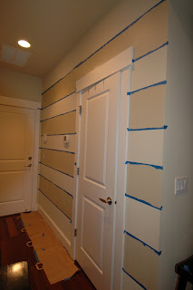
Remember this inspiration photo from this post back in October?  Well... last weekend, I tackled this project!  I'd totally encourage you to go for this project too if you're inspired.  It really only took a few hours.

Here's how it went.


The "before"

(After some careful measuring and use of a very handy laser level,
we're ready to paint!)

 
(The acutal painting took only about 20-30 minutes!)


(VOILA!  I LOVE the stripes!)


(The "after" with our hooks)

( I love seeing this everyday!  Beautiful, happy and practical!
It's all about elevating the everyday right?  )  :)


I love the finished product, but I have to admit we had a few snags in our game plan.  I don't know about you, but sometimes working with a spouse on home improvement projects can pose some challenges.  (especially, when you're married to someone who's constantly redecorating!)  :P 

I came across this amusing post written by a husband of a designer.  Click here for the full post from emilyaclark.blogspot.com  I've highlighted the ones that my husband would particularly appreciate it.  This ones for you!  :)

With this in mind I thought I would give you my two cents on how to be happily married to a designer or to someone who wants their house to look nice. For those of you who are married I thought maybe you can share this with your spouse:


1. Don’t get attached to anything….furniture, prints, paint color, etc.
2. Don’t ask why every lamp in the house is on….and don’t start talking about the peaks in the electricity bill when all the lights are on.
3. Pillows are not for comfort…….if the pillows on the couch are strategically placed, chopped in the middle and fluffed - Sit on the floor!
4. If she asks do you notice anything different?… First look at her hair, then start looking at the wall for new pictures or paint color…. Or in my case, I ask my six-year-old because he is much more observant than I am.
5. If she needs help drawing straight lines, don’t just eyeball it and use a pen to mark on the wall… get a long level and use a pencil…..lesson learned.
6. If she is intently staring at a blank wall, don’t make any plans for the weekend.
7. Be prepared to go anywhere at anytime to retrieve a great Goodwill or Craigslist find and don’t question how ugly it is. You might also want to take some security with you. You should see some of the places Emily has sent me for a bargain.
8. Don’t just invite people into your house without having at a minimum a weeks notice….not even the guys.
9. A garage is not for parking. It’s for goodwill and craigslist finds that need to be sanded and painted.
10. Just go with it…whatever color, whatever frame, whatever idea….because it will again change sometime in the near future.

Monday, November 29, 2010

WHY IT WORKS - Gallery Walls

I love how putting anything in a frame can make it special!  They make an even greater impact when you assemble the frames and make a gallery wall.  Take it one step further... I love it when the gallery is in a front hall or entrance.  What a great way to tell your story to anyone who enters your home!  It's what makes a house, a home.  These inspiration photos do just that. 

WHY IT WORKS: 

Lauren over at Pure Style Home created this beautiful entry in her home.  First of all, don't you love the color of her door?  Second, those frames sure make an impact when you enter.  Click here for details on how she created her entry. 

(image from purestylehome.com)
 
Next, this photo is of Nicole's entry from her blog, Meohmy.  These are all family photos that have been placed in simple IKEA frames.  I love how she arranged them and how she can continue to add to her gallery!  Click here to read more.


(images from meohmy.com)

Our 3rd inspiration photo comes from Paige over at paigeknudsen.blogspot.com.  Nicely done isn't it?  Paige did a great job of showing how she created this look.  Click here.


INSPIRATION:
  • Something that all these photos have in common is their scale.  Go bold!  Too often, we see photo galleries composed of frames that are too small. 
  • White mats!  They make anything look beautiful, polished and important. 
  • Frames.  Good sources for inexpensive frames are IKEA, Target, and Aaron Brothers, especially when A.B. has their penny sale!
Creating a gallery wall does not mean spending a lot of money.  There is beauty all around you in books, nature, photographs, mementos...  Where do you find beauty and joy?

This is will be my next home improvement project!  Maybe yours too?  :)

Friday, November 26, 2010

IKEA FRIDAYS - Meet SNOA

Happy Day After Thanksgiving or Black Friday!  Hope you had a good one!

I've been talking alot about using fabric for entertaining.  IKEA always comes out with some great seasonal items in December.  Here are some of my favorite holiday fabrics that would look great for any holiday party!  Here are 3 reasons I love using cut fabric.

1.  They are usually cheaper than traditional tablecloths.
2.  They look way better than plastic/paper tablecloths from the party store. 
3.  They can be used over and over again. 

So... meet the multiple variations of the SNOA fabric

This first one is SNOA FLINGA for $4.99/yd.  It comes in red, navy blue and gray!  LOVE the pattern!  I can totally see this being used as a runner on a buffet or table.  Isn't it just beautiful?  You could also cut small strips of this fabric and incorporate into your decor by tying them on your tree or garlands throughout the house. 

(Snoa Flinga)

Next, SNOA RUTAN for $5.99 yard.  Doesn't this one look so classic and cozy?!  Of course, great for a table but I'm also seeing this cut into smaller strips, maybe 12" x 36" and tied around the back of your dining chairs.  So welcoming! 

(Snoa Rutan)


Lastly, SNOA STJARNA for $4.99/yd.  Isn't this one cute?  What I love about this one is that it is so versatile!  You could easily pull this out for a birthday party or bbqs in the summer!
(Snoa Stjarna)

The great thing about all these fabrics is that they also come with a variety of coordinating accessories like these little bags and stockings.  What a great way to wrap up a favor or a gift and have all your decor and gifts coordinated.  LOVE IT!


(Snoa bag, $2.99)

(Snoa stocking, $2.99)


Wednesday, November 24, 2010

Frosty the Snowman


We just had a our first snowfall of the year and our family LOVES snow!  When I was a school teacher, I would be just as excited as the kids, waiting to see if school was cancelled for the day.  My husband turns into a meterologist and gives us hour by hour updates of the "storm".  Snow is so beautiful and what a great excuse to slow down and stay home!

With Christmas, just around the corner, I know we're looking for great gift ideas.  I love giving and receiving small, thoughtful gifts.  I love gifts that just make you say... "Aww... thanks for thinking of me!"  :) 

Here's a great one!  A Snowman Kit!  Click on over to A Girl and a Glue Gun for all the details.  How creative! 


You could easily start assembling this gift now by collecting rocks.  And if you don't want to buy scarves, I think inexpensive fleece from the fabric store would work great too.  You could get several scarves out of one yard of fabric.    This would be such a fun gift for the kids to help you put together!

Have a wonderful Thanksgiving!  I'll see you Friday!


Tuesday, November 23, 2010

More Thanksgiving Ideas


I know, only 2 more days till Thanksgiving.  Most of you probably already have your Thanksgiving dinner planned out, but just in case you're still looking for inspiration, here's a great link!  Oh my goodness... how adorable is that paper turkey leg?!  I had to fit this post in before Thanksgiving! 


Click here for a round up of some ADORABLE Thanksgiving table setting ideas.

Monday, November 22, 2010

Why It Works - Thanksgiving Tables

(from marthastewart.com)

WHY IT WORKS:  For this week, I've gathered some of my favorite table setting images to inspire your Thanksgiving table.

There are a few things that all these images have in common:

INSPIRATION
  • White dishware.  I love white, it is so versatile!
  • Low centerpieces.  They are easier to create and much better for conversation.
  • Natural elements.  Notice all the squashes, nuts, gourds, leaves that are used.  Nothing says fall more beautifully than these natural elements.
  •  Linens, notice how creatively linens are placed and used.  You really can find beautiful and inexpensive fabrics at the fabric/craft store and use them as table cloths or runners.  No sewing required!

I love the look of table runners.  You can easily make this with just 1 yard of fabric, cut in 1/2. 
I love how the napkins are placed too.


Great use of natural elements.  Artichokes and pumpkins. 
You can find everything while you're at the grocery store!


More pumpkins and I always love using white christmas lights on a mantle. 
Always homey and festive!

 
I love how they laid the runners across the table vertically and the
acorns in the hurricane.  Simple and chic!


Saturday, November 20, 2010

A Turkey Craft

Here's another great craft project that you can work on with your kids.  Aren't these turkeys adorable?  These were created by a designer in Portland, Or.  His blog, madebyjoel, is a great place for original art projects to do with your kids. 


Click here for full directions.  You could make these in all different sizes and I think these would look great on a buffet or on each table setting. 

Have fun and see you Monday!

Friday, November 19, 2010

IKEA FRIDAY - Meet the HEMNES SHOE CABINET

Last weekend, I started redoing our hallway from the garage.  I can't wait to show you pictures.  My inspiration was this post that I did a couple of months ago.  This shoe cabinet is next on my list to complete the makeover.  I can't wait to get this! 

There aren't too many shoe storage options availlable where you can actually hide the shoes!  I've considered bookcases and baskets, cubbies, shelves, but nothing seems to get the shoes stored and out of sight as well is this guy!  I think it's $129 well spent!


Here's a couple of photos of HEMNES in action.

(image from ikea.com)


(image from craftpad.com)

Have a great weekend!  Many of you might be prepping for Thanksgiving.  Check back tomorrow, I have a great turkey craft that would look great on a table or buffet. 

Thursday, November 18, 2010

A Prince and a Princess

I have to admit, I've been a little distracted the last 2 days.  I've been spending more time watching tv than usual, getting all engrossed with the details of Prince William and Kate Middleton's engagement.  Aren't they just charming?


(image from abc.com)

I think for me, it's just so refreshing to see a romance play out with such class and dignity.  Something I don't think we see enough of these days.  I love Kate's style too!  So chic, sophisticated and always classy!  You don't see that from very many 28 year olds.  Well done!  I'll definitely be one of the estimated 3 billion people who will watch the wedding next summer.    I can't help it, I'm still a sucker for a great love story!

Tuesday, November 16, 2010

Thankfulness Placemats

I found these Thanksgiving placemats in my Family Fun magazine and I thought they were so great!  Especially for preschoolers who don't read yet.  We did this with our 5 year old and it was so much fun talking about each item!  It's never to early to teach about THANKFULNESS!

Click here to download them for free!

Monday, November 15, 2010

Why It Works - A Divine Kitchen

When I came across this kitchen, my heart said, "WOWEE!"  Candice Olson of Divine Design is another one of my favorite designers and boy, she did not disappoint with this one!  This kitchen took my breath away and I"ll tell you why.  :)

WHY THIS WORKS:


(image from hgtv.com)

  • That island with the white quartz countertop falling all the way over the side of the island.  Drama!
  • Gorgeous lighting!  Candice always does a great job with lighting, notice all the different types of lighting she's used:  Small can lights, sleek pendant lights over the island that are small enough so they don't take focus away from the kitchen as a whole, and that funky dining light.  So much eye candy!
  • Contrast of light and dark again.  I love the light counters with the dark, zebra wood cabinetry.  She picks up more dark contrast with the woven shades and the floor

INSPIRATION: 
  • Floors.  I typically like hardwood throughout a home, with the exception of the bathrooms of course.  But this room is a great example of how well porcelain tile can work in a kitchen.  I love the dark gray color and how it's laid in a brick pattern. Beautiful!
  • Island design.  Again, I typically like the look of one long, sleek  island.  But I love how she included a raised portion to separate the prep area from the bar area.  Since this room is so open, this design works great to conceal some of the mess of food prep. 
  • Window treatments.  Many people are stuck when it comes to dressing their windows.  The woven shades over the sink is great, as well as the casual grommet drapes on the sliding doors.  Perfection!

Friday, November 12, 2010

IKEA FRIDAY - Meet Alang and Ljusas Salbo

Remember this photo from Monday's inspiration room?

(image from lucyandcompany.com)


Well my IKEA picks for this week were inspired by those beautiful lamps.

Meet Alang.  She has been at IKEA now for many years.  She used to come with only brown or white shades, I was happy to see this beautiful gray shade this year!  Like most designers... I'm in love with all things gray.  This is a beautiful and very versatile lamp.  I have a pair of these lamps that I use on our night stands in our master bedroom right now.  But I could easily move them into our entry or family room.  My favorite features of this lamp are the adjustable base and the delicately woven shade.  You would think it costs way more than $29.99.


Next up, meet Ljusas Salbo.  What I notice first about Ljusas is her gorgeous figure!  I've also loved gourd lamps and this is a great variation of that.  Also, the color... LOVE it.  This lamp comes in other colors, but the gray is my favorite!  You can have Ljusas in your home for a mere $39.99.  Take a look back at our inspiration room, I think it's a pretty good match!


Alright!  Enjoy your weekend.  I will have a lot more to share next week on wall decor!

Thursday, November 11, 2010

Operation Christmas Child


I recently read a short article on party favors.  I know, most people have a love/hate relationship with them, including me.  I feel like I'm constantly dealing with them at our house, yet for my son's birthday party coming up, I'm looking for small goodies again.  :P  

So... in the spirit of making the best use of the favors that we all give and get, here's another idea.  I've been collecting these small toys and school supplies (when they're on sale in September) and saving them for making Operation Christmas Child shoe boxes for Samaritans Purse, a Christian relief and evangelism ministry.  We've done it for 2 years now and it is such an easy and tangible way for children to understand the joy and importance of giving and serving others.  Tonight, I watched one of their promotional videos with my 5 year old.  I want him to see how much his small sacrifice impacts the lives of other children, just like him.


Their National Collection week is next week, November 15 -21st.  Here's a link to information on how, where and when to drop off your donation.  What a great way to start off the holiday season and Thanksgiving.


This is such an easy to love and serve others, I'd love to hear how this might impact your family!

Wednesday, November 10, 2010

Art - Get Personal

A friend of mine is trying to dress up her walls with some artwork and asked my opinion on several pieces.  My first question has always been, "Do you LOVE it?"  And if the answer is no, regardless of price, color, size or anything else, then it does not belong on your wall!  What makes good wall art?  In my humble opinion, it's anything that makes you smile when you see it.  I especially love it when people use personal objects or pictures as artwork in their home.

Here's a couple of great examples:


(image from lucyandcompany.com)

Here's another photo of interior designer, Beth Keim's home from Monday's post.  I love this little corner of her room!  Look how she's used her personal objects as art.  We have some precious baby photos placed along with an adorable framed sweater.  Anything can be art!  I bet she smiles everytime she sees that corner. 


Here's another example.  I was helping another friend add some artwork to her son's nursery.  I spotted this precious song which was just tucked in a stack of papers and cards.  What a gem!!  This is sweet song written for her son from his grandfather.  I told her she had to get that in a frame and put it up! Talk about making your heart sing!


So... if you have blank walls and you don't know what to do... look around your house first!  Look for special cards, letters, photographs, postcards, etc...  Anything that reminds you of a special person, time or place.  Put it in a frame or a shadow box and voila!  Beautiful and personal art!

Tuesday, November 9, 2010

Halloween Party Details

Here are some pictures from our Halloween Party.  A couple of weeks ago, I shared my inspirations so I wanted to show how things turned out in real life.

It was a great night!  It was so much fun seeing all the kids dressed up and so excited about Halloween!  We had about 20 kids under the age of 5.  It was quite a scene once we headed out to Trick or Treat!  We were happy to be a part of creating some special memories for our kids and their friends.  Scroll all the way to the bottom for ideas for your next party.

We kept the decor simple with some
 Halloween lights and pumpkins

A simple tablescape with a black/orange polka dot fabric.
 The crepe paper cone for our pendants were fun. 

I was inspired by mini cones that Martha Stewart made
for small, stringed lights.  I just enlarged the cone
and added crepe paper "petals"

We had a photo booth set up.  A dear friend helped us with the logistics. 
We shot the photos "photo booth" style.  Can you guess our costume?
THE WIGGLES!

Trying to add some balance to all the candy with fruit kabobs.

Popcorn served in unbleached cupcake liners.

The caramel apple bar was a BIG hit! 

INSPIRATIONS:  Some ideas that you might want to try for your next party.

  • TEAMWORK!  Cohost with a friend(s)!  Enlist the help and talent of your friends.  Many hands make for light work!  (and more fun!)
  • SIMPLE MENU!  I'm so glad we went with just finger foods/desserts.  Everyone still had a great time and it allowed us to have a bigger guest list.
  • FABRIC!  Many times, its even cheaper than plastic/paper tablecloths at the party store.  For example, Joann's is always having sales on their fabric.  I spent $5.00 for our tablecloth.
  • MINI CROCKPOT!  This was my first time using one of these and it worked great!  You can use it for caramel, chocolate or cheese.  Just prepare some toppings, items to dip and you're all set!  (set it and forget it.)   :)
  • RELAX and HAVE FUN!  Enjoy the company of your guests.  That was the whole point right?  
Lastly, never feel like you need a big budget to host a party like this.  Total cost for this party was probably $30.  The decorations were around $10-15 and a few friends helped with the food. 

LinkWithin

Related Posts Plugin for WordPress, Blogger...